Introduction
Harmful Algal Blooms (HAB’s) are rapid increases in the number of algae in a concentrated area which cause negative effects to other organisms. These negative effects can be the result of algae produced toxins, oxygen depletion, decreased light availability, and other causes. In recent years more attention has been paid to these events as they pose threats to valuable fisheries and aquacultures, endangered or threatened species, and in some cases even to humans. Red tide is a form of harmful algal bloom which can infect shellfish and seafood which makes its way into human diets. Scientists believe that with the increase in ocean temperatures HAB are becoming more frequent EPA (2021). This report I investigates the temporal nature of these events as well as trends in characteristics of the blooms.
hide
knitr::include_graphics("habimage.jpg")
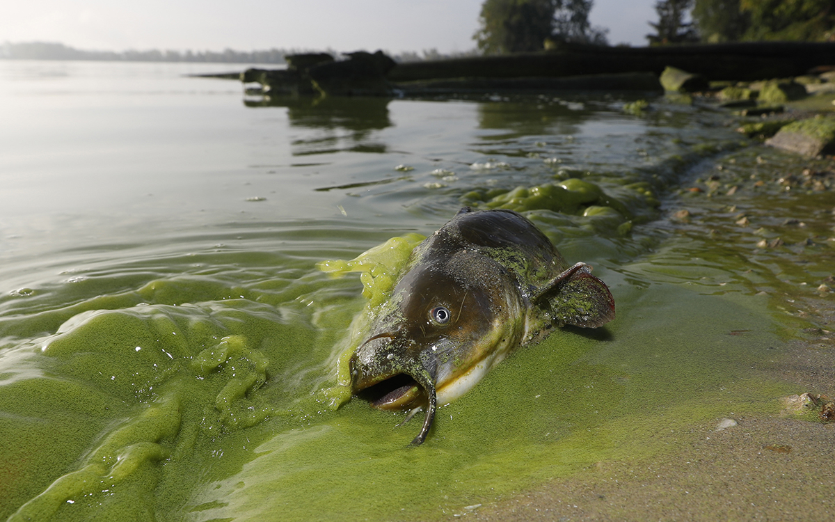
Figure 1: Algae-filled waters of North Toledo, Ohio, in September 2017 | Photo by Andy Morrison/The Blade via AP Photo
hide
### read data and create df for use
hab <- read.csv("hab_world.csv") #read csv with data
hab <- hab %>% filter(eventYear>1989) #remove first couple of year withs incomplete data
crs_use <- "+proj=laea +lat_0=30 +lon_0=-95" #create crs for shapefile data
hab_sub <- hab %>% drop_na(latitude) %>% drop_na(longitude) #remove data without sf data to map
hab_sf <- st_as_sf(x = hab_sub,
                   coords = c("latitude", "longitude"),
                   crs = crs_use) #turn hab dataframe into sf format

### create a sf dataframe of the world
world <- ne_countries(scale = "medium", returnclass = "sf")
Methods and Results
To explore temporal trends in Harmful Algal Blooms data were visualized showing the location of algal blooms each year. Fig 1. shows the HAB’s which occurred that year in green. Fig 2. shows the total number of HAB’s which occurred from 1990 to 2021, with HAB’s being added to the figure each year. The map was created using the ggplot2 and sf packages, while the animation was done using gganimate and gifski.
hide
### create map of hab events overlayed on world map by year
map <- ggplot(data = hab_sub) + #define df
  geom_point(aes(x = longitude, y = latitude), color = "green", size = 2.5) +  #plot HAV events
  geom_sf(data = world) +  #plot world map
    annotation_north_arrow(location = "bl", which_north = "true",
        pad_x = unit(0.75, "in"), pad_y = unit(0.5, "cm"),
        style = north_arrow_fancy_orienteering) + #compass for aesthetics
        labs(title = "Harmful Algal Blooms in {frame_time}") + #title plot
        transition_time(eventYear) + #set the transition time for animation
        theme(axis.title.x=element_blank(),
          axis.text.x=element_blank(),
          axis.ticks.x=element_blank(),
          axis.title.y=element_blank(),
          axis.text.y=element_blank(),
          axis.ticks.y=element_blank()) + #remove x and y axis and give title
  ggtitle('Harmful Algal Blooms in {frame_time}')

#create year values
num_years <- max(hab_sub$eventYear) - min(hab_sub$eventYear) + 1

#create animation
animate(map, nframes = num_years, fps = 2, end_pause = TRUE)
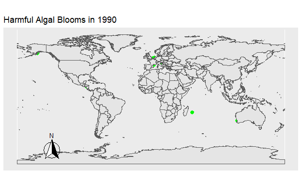
Figure 2: Figure 1. The location of all Harmful Algal Blooms in green observed each year.
hide
###create animation with cumulative data
map_with_shadow <- map +
  shadow_mark() +
  ggtitle('Cumulative Harmful Algal Blooms by {frame_time}')
animate(map_with_shadow, nframes = num_years, fps = 2, end_pause = TRUE)
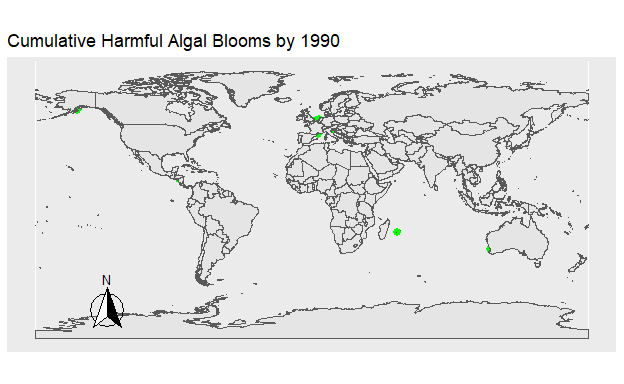
Figure 3: Figure 2. The location of all Harmful Algal Blooms in green plotted onto the map progressively by year.
After visualizing HAB events, their trend over time was explored. A least squared regression line showed that there was a strong relationship between time and number of HAB’s (p=3.458e-05). However, the data had a clear non-linear aspect to it.
hide
# plot hab events per year and fit a linear regression line
ggplot(data=hab_year) +
  geom_point(aes(x=eventYear,y=n)) +
  geom_smooth(method='lm',aes(x=eventYear,y=n), se=FALSE,color='red') +
  labs( x = "Year", y = "Frequency of HAB Events")
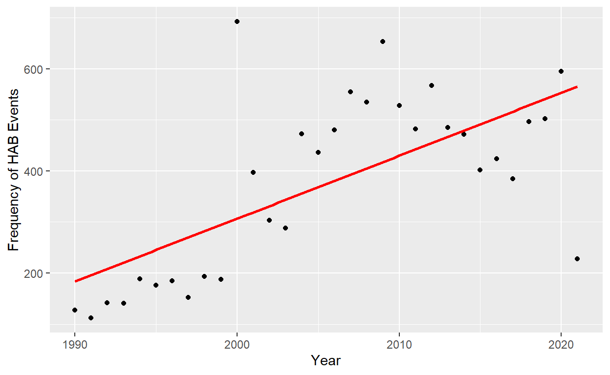
Figure 4: Figure 3. Frequency of harmful algal blooms reported by year. Least square regression linear line fit to the data in red: y = -30304.087 + 15.297years (P = 3.458e-05, R squared = 0.4219).
Using the deSolve package, logistic growth was used in an attempt to more accurately model HAB events over time. After graphing the model (Fig 3.), its accuracy was tested by plotting the modeled data against observed values to show the difference between expected and observed numbers of HAB’s.
hide
#logistic growth function
logistic_growth <- function(t, N, p) {
  with (as.list(p), {
    dNdt <- rate*N*(1-N/K)
    return(list(dNdt))
  })
}

# definding time variables
T_init = 1990
T_lim = 2021
t = seq(T_init,T_lim,1)

# initial population
N_init <- c(N = 40)

#logistic parameters
estimatedRate <- 0.325
estimatedK <- 500

# parameters of the model
pars_logistic <- c (
  rate = estimatedRate, # rate at which the population changes
  K = estimatedK ) # limiting capacity

# solve ode and them produce simulated data
N_t <- ode(y = N_init, times = t, parms = pars_logistic, func = logistic_growth)

# convert simulated data into tibble
df_sim_logistic <- as_tibble(N_t) %>%
  mutate(eventYear = as.numeric(time),
         N_logistic = as.numeric(N)) %>%
  select(-time,-N)

# join the data and the simulated data
year_log <- hab_year %>%
  left_join(df_sim_logistic, by = c("eventYear" = "eventYear"))

#graph
ggplot(data=year_log) +
  geom_point(aes(x=eventYear,y=n)) +
  geom_line(aes(x=eventYear,y=N_logistic), color='red') +
  labs( x = "Year", y = "Frequency of HAB Events")
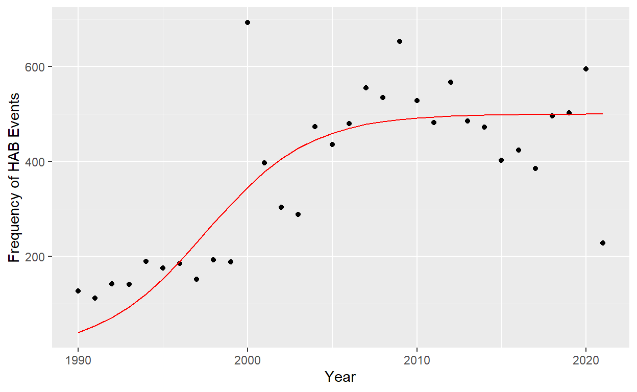
Figure 5: Figure 4. Frequency of harmful algal blooms reported by year. Logistic model fit to the data in red: y = 500/(1+e^-.2t) logistic function r= .2, k=500 (sum of squares = 355,471).
hide
 #calculate sum of squares
# sum((df_sim_logistic$N_logistic - hab_year$n)^2)
# the observed prevalences:
with(hab_year, plot(eventYear, n, pch = 19, col = "red", ylim = c(0,700)))
# the model-predicted prevalences:
with(df_sim_logistic, lines(eventYear, N_logistic, col = "red", type = "o"))
# graph the model error by comparing observed and predicted prevalences
segments(hab_year$eventYear, hab_year$n, df_sim_logistic$eventYear, df_sim_logistic$N_logistic)
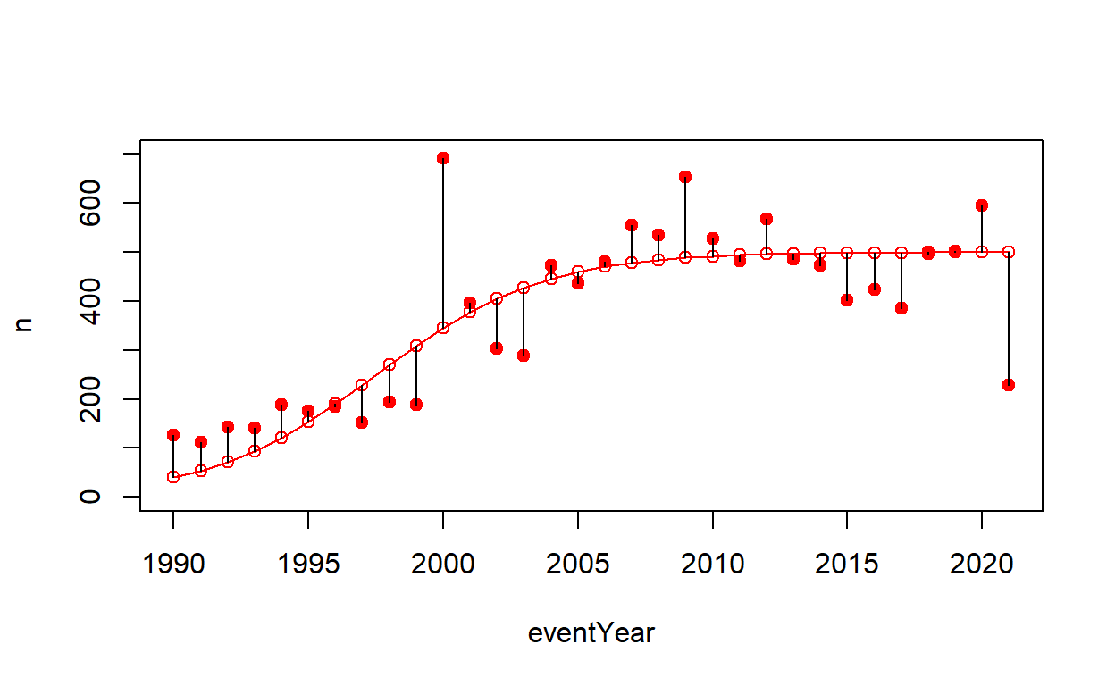
Figure 6: Figure 5. Simulated results based on the logistical model plotted against observed results in red. The difference was visualized by black lines.
After showing the growth of HAB’s, how these events could be impacting the environment was explored. An issue of concern around HAB’s is their impact on fisheries, as HAB’s can poison important aquatic resources. Plotting the percentage of HAB events that are toxic to seafood shows that that percentage has been on the rise. Not only are the number of HAB’s increasing, but a greater percentage of them are damaging the fishing industry and causing health concerns for consumers of seafood.
hide
hab_seatox <- hab %>%
  select(eventYear, seafoodToxin) %>% #select variables of interest
  group_by(eventYear) %>%
  count(seafoodToxin) %>% #make variable n: number of toxic events/year
  pivot_wider(names_from = seafoodToxin, values_from = n) %>% #make 0 and 1 columns with n as the value
  rename("seatox_true" = "1","seatox_false"="0") %>% #rename columns
  mutate(seatox_true = replace_na(seatox_true, 0)) %>%
  mutate(seatox_total = seatox_true + seatox_false, seatox_percent = seatox_true/seatox_total) #create total event and percent true event columns

seatox_fit <- lm(seatox_percent ~ eventYear, data=hab_seatox) #find linear fit
# summary(seatox_fit) #find the goodness of the fit
hide
# plot percent of HAB's which are seafood toxic per year
ggplot(data = hab_seatox) +
  geom_point(aes(x=eventYear,y=seatox_percent)) +
  ggtitle("Percent of Toxic Seafood Inducing Events per Year") +
  geom_smooth(method='lm',aes(x=eventYear,y=seatox_percent), se=FALSE,color='red') +
  labs(x = "Year", y = "% HAB's resulting in Seafood Toxicity")
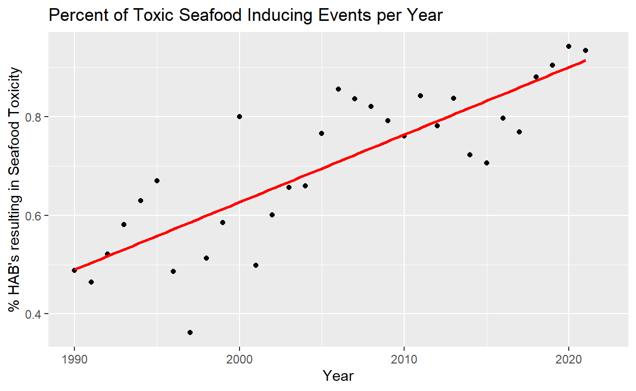
Figure 7: Figure 6. The proportion of HAB events that results in seafood toxicity per year. Least square regression linear line fit to the data in red: y = -30304.087 + 15.297years (P = 5.133e-09, R squared = 0.6745)
hide
#change seatox presence into a categorical variable
hab_sub_seatox <- hab_sub %>%
  mutate(SeafoodToxin = as.character(seafoodToxin))

map2 <- ggplot(data = hab_sub_seatox) + #define df
  geom_point(aes(x = longitude, y = latitude, color = SeafoodToxin), size = 2.5) +  #plot HAB events
  geom_sf(data = world) +  #plot world map
    annotation_north_arrow(location = "bl", which_north = "true",
        pad_x = unit(0.75, "in"), pad_y = unit(0.5, "cm"),
        style = north_arrow_fancy_orienteering) + #compass for aesthetics
        labs(title = "Harmful Algal Blooms in {frame_time}") + #title plot
        transition_time(eventYear) + #set the transition time for animation
        labs(x = "",
             y = "") + #remove x and y axis and give title
  ggtitle('Harmful Algal Blooms in {frame_time}')
#animate map
animate(map2, nframes = num_years, fps = 2, end_pause = TRUE)
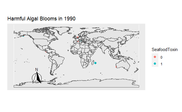
Figure 8: Figure 7. The location of all Harmful Algal Blooms observed each year. Those which were toxic for seafood are blue, and those which were not are orange.
Conclusions
Harmful Algal Blooms are showing a clear rise in frequency over the past decades. Understanding why this increase is occurring, what impacts it may have, and what future growth may look like will be important in the preservation of our marine resources. Not only are the number of blooms increasing, but due to their changing algal compositions, greater proportions of the blooms are damaging to marine life. These two clear trends show the urgency of the issue. HAB’s are estimated to cause around 20 million dollars in losses for US fisheries and around 50 million dollars in total damages when costs of public health and tourism are included Donald M. Anderson (2000).
Class Peer Reviews
Reviewer 1
- State the authors’ objectives and the general questions that the authors are considering. Do the results and figures support the conclusions made in the report?
The author’s objective is to look at whether the frequency of Harmful Algal Blooms is increasing over time. They also wanted to look at whether the relationship between HABs and time is linear, exponential, or logistic. Finally, they looked at whether the percentage of toxic HABs is increasing over time, specifically with their presence in seafood. The results support the conclusions made since 1) they concluded that HABs were increasing over time logistically, which is supported by figure 4 that shows a logistic curve of increasing HABs over time. 2) they concluded that the percentage of toxic HABs in seafood is increasing, which is supported by Figure 7.
- Discuss the foundations of data visualizations relative to the figures presented in the report.
For Questions Formulation, though they didn’t phrase them as questions, the research goals were clear. For Data Acquisition, they talked about the R packages they used, but not where they got the data (that I saw). For Data Wrangling and Visualization, they did a great job, all of the graphs look clean and clear. For Modelling and Inference, their conclusions made sense based on their data. For Communicating Findings, they made a clear presentation that made sense to someone who isn’t super familiar with the topic.
- State 3 things that are strong about their report and 2 things that can be improved.
Strong: 1. map graphs: having made animated maps myself, I know they can be a beast to tackle and the animated maps in this project look really pretty and are very effective in what they are trying to convey! 2. Simulated results based on logistic model (figure 6). The scatterplot is good at showing how close a lot of the data fits to the best fit line. 3. The background information was very interesting and appropriately prepared the audience for the data that was presented.
To Improve: 1. Grammar, formatting, etc. I noticed several typos and the formatting of the figure caption titles were confusing since it listed two possible numbers (ex: Figure 6: Figure 5.) 2. I would have liked to see more in the conclusion section about goals for future research. They talked about it a little bit, but I feel like there is more to talk about.