Introduction
Climate change is an issue that grows in relevance everyday. This being said, the issue has not been given enough attention to what it deserves. Climate change, as it occurs through different chemical emissions being let into our atmosphere, has decades of science and data behind it. For our final project, we wanted to show just how emissions rates have grown or changed throughout the countries of the world. Through looking at the countries that output the most emissions, we can try and see what influences this output. A few factors we are looking at are the population of the country and the number of billionaires in the country. To do this, we are using three different data sets. The first data set is our Emissions.csv data set (Dennis Kafura, 2019), which has information on countries and levels of different emissions from 1970-2012. We will also be using the global_development.cvs dataset, which has data from 1980-2013 for each country in a variety of different categories. For the purpose of this project, this is where we are drawing our population data from. The final data set we are using is the billionaires.cvs (Billionaires CSV File, 2016) data set, which gives in depth information on the top billionaires from three different points within the last 40 years. Our interest in studying the climate crisis is driven by an awareness of how significant and catastrophic climate change is, and a hope that understanding the relationship between population size and emissions might shed light on some of the variables driving the climate crisis.
Methods and Results
Our key objective in this study is to increase understanding of the factors that increase or reduce a country’s annual emissions. To complete this objective, we used the R package “tmap” and the Emissions csv to create visualizations of the countries that have the highest emissions in each category from year to year. Tmap has shapefiles and data for every country in the world, which we joined with the emissions data. We used tidyverse to get many of the data processing functions for the visualization and to do exploratory analysis and data wrangling. We then used “plotly”, “gganimate”, “gifski”, “transfomr”, and “png” to make the maps animated so that one could visualize the changes in emissions levels for each country per year.
Our maps demonstrate that emissions have risen dramatically since the emissions dataset was first started. Figure 1 shows the increase in CO2 emissions from 1980-2012, and, since we know the warming impact that CO2 has on the environment, this provides a grim projection for the future climate since the rise in CO2 emissions does not seem to be slowing. Other greenhouse gases (N2O and CH4 have also been increasing. Though they are generally released in lower quantities (when measured in tons), the standard metric for these gases is their warming potential when compared to CO2. For example, 1 unit of N2O released into the atmosphere is the equivalent of about 300 units of CO2 released. Figure 2 shows the amount of gases released in the 1980-2012 time period when the N2O and CH4 warming potentials are adjusted to CO2. We know that CO2 is rising rapidly (Fig 1) and Figure 2 demonstrates that N2O and CH4 also play a significant part in that warming. When looking at the breakdown of greenhouse gas emissions by country (Figure 3), we see that the United States and China, followed by Russia and India, appear to have the highest emissions, and are trailed by almost every other country in the world. Figure 4 also shows us that when we look at where most of the billionaires are located, in the most recent recorded year in the figure (2014), most of them claim China and the United States as their country of origin. We can’t claim a causal relationship between the presence of billionaires in a country and their level of greenhouse gas emissions due to having too few data points, however, this could be an area for further study since many of the economic systems that create billionaires are the same ones that encourage climate destruction.
hide
##DATA WRANGLING
#importing world data
data("World")
st_crs(World) <- 4326

#Sorting Global Development dataset
globdev2 <- glob_dev%>%
  select(Country, Year, Data.Health.Total.Population)

#creating a more linear scale for population
World2<-World%>%
  mutate(logpop=log10(pop_est))

#combining Billionairs and World datasets
worldbillionaires <- billionaires %>%
  filter(!year > 2012) %>%
  left_join(World2, by = c("location.citizenship"="name"))

#joining emissions and world
worldemissions<-World2 %>%
 left_join(emissions, by=c("name"="Country"))

#joining emissions and global development
worldemissions2 <- worldemissions %>%
  left_join(globdev2, by = c("name"="Country", "Year"="Year")) %>%
  filter(!Year < 1980) %>%
  filter(!Year > 2013)
hide
#CO2
worldemissionsco2<-aggregate(Emissions.Type.CO2 ~ Year, worldemissions2, sum)

#N2O
worldemissionsn2o<-aggregate(Emissions.Type.N2O ~ Year, worldemissions2, sum)

#CH4
worldemissionsch4<-aggregate(Emissions.Type.CH4 ~ Year, worldemissions2, sum)

#joining
worldemissionsall<-worldemissionsco2%>%
    full_join(worldemissionsn2o, by = c("Year"="Year"))

worldemissionsall<-worldemissionsall%>%
    full_join(worldemissionsch4, by = c("Year"="Year"))

worldemissionsall <- melt(worldemissionsall ,  id.vars = 'Year', variable.name = 'series')
Figures
hide
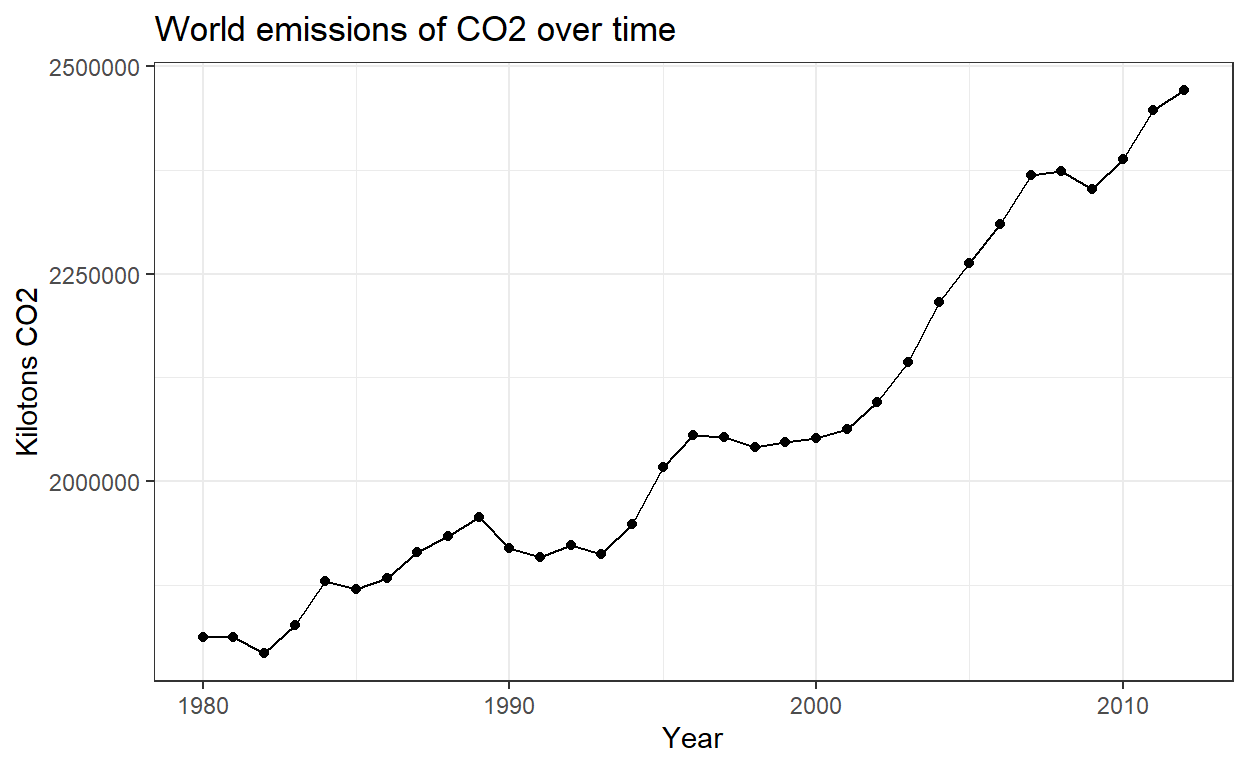
Figure 1: Kilotons of carbon dioxide released across the world between 1980 and 2012.
hide
#all
worldemissionsall%>%
ggplot(aes(x=Year, y=value, color=series))+
  geom_point()+
  geom_line()+
  scale_color_colorblind(name = "Greenhouse Gas", labels = c("CO2", "N2O", "CH4"))+
  labs(title="World emissions over time by greenhouse gas type", y="Amount in kilotons CO2")+
  theme_bw()
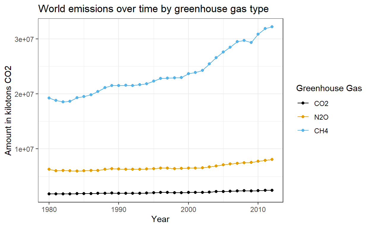
Figure 2: Emissions of greenhouse gases (Carbon Dioxide, Nitrous Oxide, and Methane) between years 1980 and 2012. Amounts of N2O and CH4 are converted into kilotons of CO2 because this shows a consistent unit measurement for the atmostpheric impact of these emissions.
hide
#maps
#CO2 Emissions
mco2 <- tm_shape(worldemissions2) +
  tm_polygons("Emissions.Type.CO2") +
  tm_facets(along = "Year")

tmap_animation(mco2, delay=40, filename = "mco2.gif")
hide
knitr::include_graphics("mco2.gif")
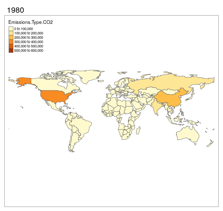
Figure 3: Maps of the greenhouse gas emissions around the world over time
hide
#N2O emissions
mn2o <- tm_shape(worldemissions2) +
  tm_polygons("Emissions.Type.N2O") +
  tm_facets(along = "Year")

tmap_animation(mn2o, delay=40, filename = "mn2o.gif")
hide
knitr::include_graphics("mn2o.gif")
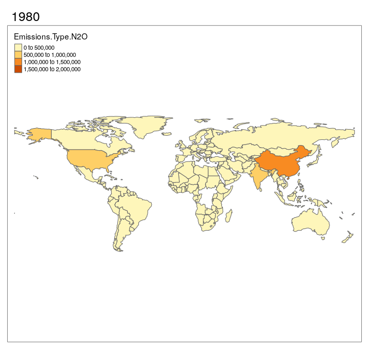
Figure 4: Maps of the greenhouse gas emissions around the world over time
hide
#CH4 emissions
mch4 <- tm_shape(worldemissions2) +
  tm_polygons("Emissions.Type.CH4") +
  tm_facets(along = "Year")

tmap_animation(mch4, delay=40, filename = "mch4.gif")
hide
knitr::include_graphics("mch4.gif")
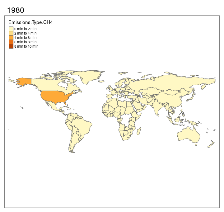
Figure 5: Maps of the greenhouse gas emissions around the world over time
hide
#making years in billionaires dataset categorical
bill<-billionaires%>%
  mutate(year=case_when(year==1996~"1996",
                        year==2001~"2001",
                        year==2014~"2014"))%>%
#removing outliers
  filter(demographics.age>0,
         company.founded>=1000)

#graphs
  ggplot(data=bill, aes(y=fct_infreq(location.citizenship), fill=year))+
  geom_bar()+
    facet_wrap(~year, scales="free")+
    theme(axis.text = element_text(size = 5), legend.position = "bottom")+
    theme_bw()+
    labs(title="Number of billionaires by country of origin", x="Number of billionaires", y="Country of Origin", fill="Year")
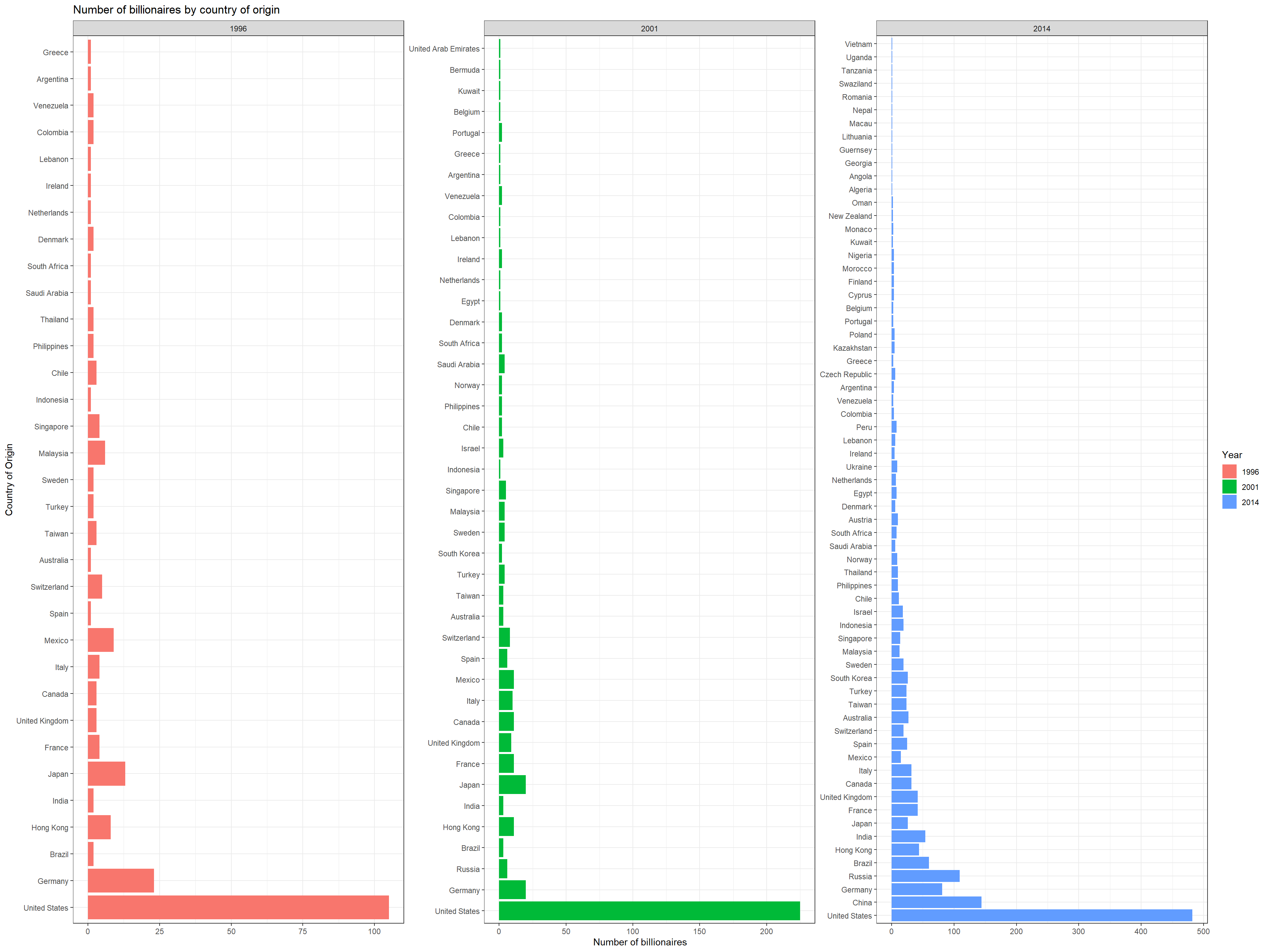
Figure 6: Graph of the countries that have the most billionaires, measured in 1996, 2001, and 2014
Conclusions
Through our visualizations, we see that emissions have spiked dramatically since the beginning of the 21st century. Looking at specific emission data, you can see that CH4 poses the most danger to the environment. It is the emission with both the highest output level throughout our range of years as well as the main cause of the spike in emissions from the onset of the 21st century. Looking at the countries through our range of years, we can see that the US and China are the biggest contributors to the output of the various emissions. Other countries with large populations such as Brazil, Russia. and India start to increase the rate of their emissions as the graph goes on. These graphs show the direness of the climate crisis because, as more greenhouse gases are emitted and the climate continues to warms, there is more and more that people will have to do to recapture those emissions and avoid irreparable atmospheric damage. Though we cannot prove that the number of billionaires are necessarily related to the increased pollution of the atmosphere, we can say that some of the biggest polluters also have a large number of billionaires, and that many billionaires have made their money, at least partly, through climate endangerment. We believe that investigating the relationship between concentrated wealth and climate degradation would be a good direction to continue this research.
Class Peer Reviews
Reviewer 1
- State the authors’ objectives and the general questions that the authors are considering. Do the results and figures support the conclusions made in the report?
The authors’ main objective was to increase the understanding of the factors that increase or reduce a country’s annual emissions. I think that the visualizations support these findings because the conclusion states that the “US and China are the biggest contributors to the output of various emissions”. The conclusion also suggests that “we can say that some of the biggest polluters also have a large number of billionaires,”. The figures support this conclusion as the plots of the world display the countries with the highest contributors that were mentioned, and the bar plot suggests that the US was a country with the highest number of billionaires. The authors of the report also make it clear that the number of billionaires may not have been a factor that influenced greenhouse gas emissions, yet they do suggest that there is a correlation between countries with the highest number of billionaires and the countries with the highest greenhouse gas emissions.
- Discuss the foundations of data visualizations relative to the figures presented in the report.
The data from the first line plot was sourced from the emissions.csv dataset from Dennis Kafura, who is a credible author with a bachelors in Mathematics and a PhD in Computer Science. The data also contains no errors. The explanatory variable presented in the plot was time in years as a categorical ordinal variable and kilotons of CO2 as a numerical variable; 4 dimensions were used on the x-axis and 3 were used on the y axis. The graph was scaled effectively, and colors were not used which was an appropriate choice as to not distract the viewer from the intended meaning of the plot. The plot suggests that there was a significant increase of kilotons of CO2 in the year 2010 as compared to the year 1980. The increase was not consistent, however, and there were evident decreases in kilotons of CO2 in the years of 1990-1995, 1981-1982, and 2008-2009. The target audience for this plot could be the general public as it is human activities that contribute to CO2 emissions. A deeper meaning from this plot could be that the reason that CO2 emissions increase with time is because more modern activities are ones that are larger contributors to CO2 emissions. The purpose of this plot could be to encourage viewers to be more mindful of their habits that could be contributing to CO2 emissions.
The report also included a very similar line graph that was from the same source and also contained no errors. The explanatory variable was time in years as a categorical ordinal variable and kilotons of CO2, N20, and CH4 as the response variables that were also numerical variables. 4 dimensions were used on the x-axis, and 3 dimensions were used on the y-axis. The plot was appropriately scaled and scientific notation was used on the y-axis to make the plot easier for the viewer to visually interpret it; color was used effectively to distinguish each greenhouse gas. The main observation from this report is the fact that CH4 emissions were significantly larger than the other two greenhouse gas emissions. The target audience of this report could be different corporations that sell products that contribute to the emissions of greenhouse gasses, and thus a larger meaning of this report could be that corporations that are promoting products that contribute to CO2 emissions could be a larger threat.
The third figure of the report was from the same source and also contained no errors. The variables presented were country as a categorical nominal, year as a categorical ordinal variable and ranges of CO2 emissions as a numerical variable. The plot made effective use of color to signify that the darker the color the higher the range of CO2 emissions; these colors got darker as the years went on. The target audience for this report could have been people from a variety of cultures, and the map suggested that the United States, Russia, and India had darker colors. A larger meaning of the plot could be that countries known for having many manufacturing companies could be larger contributors to climate change.
Lastly, The report also included a bar graph that was sourced from the Billionaires CSV file and also contained no errors. The source is deemed credible as it was created by scholars at Peterson Institute from International Economics. The variables presented in this plot was year as a categorical ordinal variable, country as a categorical nominal variable, and number of billionaires as a numerical variable. The plot was scaled effectively and color was used appropriately to distinguish each year. The main observation from this visualization was that the US had the greatest number of billionaires across all of the years. It is also noted that the US had also significantly higher emissions of all the greenhouse gasses as compared to other countries. The target audience for this plot could be middle class and low income people who have been manipulated to believe that their daily actions are what is the largest contributor to greenhouse gas emissions. Hence, a larger meaning of this could be that countries with more billionaires are reported to have larger greenhouse gas emissions, meaning that corporations that contribute to these greenhouse gas emissions could manipulate the general public that it is largely their fault. The purpose of this graph could me to make the general public aware of this fact.
- State 3 things that are strong about their report and 2 things that can be improved.
One thing that was strong about their report was the fact that they clearly listed the packages they were using, and they briefly yet clearly explained why they needed to use each package. I also think another strength of their report was how they joined multiple datasets. I thought it was very insightful of them to observe that the second dataset contained shapefiles of and data for every country and the first dataset had the data of the emissions; joining these two datasets helped them address their main objective and produce a more insightful conclusion. Lastly, their data wrangling section was well-commented and well organized which showed a thorough understanding and was also easy for the reader to follow.
Something that can be improved about their report is that in the introduction they mentioned that climate change has “decades of science and data behind it”. I think that the presentation would have been a little bit more informative and credible if they gave specific examples of the science and data behind it and cited their sources. I also think that they could have restated the main objectives in their conclusion to make their report more coherent as I did have to scroll back up to the introduction to make sense of it.
Reviewer 2
- State the authors’ objectives and the general questions that the authors are considering. Do the results and figures support the conclusions made in the report?
The project looked to examine the change in rates of anthropogenic greenhouse gas emissions by country. They then looked to examine the relationship these emissions have with population size and wealth. The figures and results provided show a direct relationship between emission and time, addressing that aspect of their question. However, population size is not addressed by any of their figures or results.
- Discuss the foundations of data visualizations relative to the figures presented in the report.
The data visualizations shown here all clearly address an aspect of their investigation and display the information in a digestible manner. The captions for figures 3,4, and 5 could have been more descriptive as they were identical yet contained different information. Overall however, all visualizations directly addressed some part of the question and communicated well.
- State 3 things that are strong about their report and 2 things that can be improved.
The background provided was clear and explanations were sound, overall did a good job communicating their information. The figures constructed conveyed information well and were aesthetically pleasing. The methods were very explicit which gave readers a clear view into how everything was done.
The report briefly addressed population and billionaire status in the conclusions, but all claims were made from observation, rather than visualizations or statistical tests. Making visualizations of the relationship between population size and emissions, as well as number of billionaires and emissions, would more clearly examine these relationships. Some proofreading would also benefit the report as the language could be clunky and repetitive at times. Overall a very good report that addressed its central premise well and utilized data science tools effectively.
Reviewer 3
- State the authors’ objectives and the general questions that the authors are considering. Do the results and figures support the conclusions made in the report?
The research project aims to explore relationship between climate change, specifically greenhouse emission and variables such as country’s population and the number of billionaires. They are hoping to find general trends in emission and using country level data to infer conclusions. The results and figures are in the direction of their objective since the stated purpose of the study is to increase undersetanding of the factors that may change a country’s annual emissions, which is a very open-ending research objective. The conclusion is that a few countries such as US, China, India and Russia are the highest emitters and that CH4 poses the most danger to the environment.
- Discuss the foundations of data visualizations relative to the figures presented in the report.
The first part of data visualizations, the lined time series depicting world emissions are very straightforward but too basic, it is not offering any new information since it is a general public knowledge that emission has been increasing over time.
In the texts, the authors stated that CO2 as an emission has the most quantity, yet in the first two graphs, CH4 and N2O appear to have more emissions since it is above the line of CO2, and the y-axis is amount in kilotons CO2. I am unaware of whether this is because authors have chosen to use emissions as a percentage of CO2 or simply a typo in labeling y-axis.
Shapefile world map graphs are not friendly to people who are bad at geography, because of a lack of labeling in the map. We can only see trends of US, China, India and somewhat Russia increasing their emissions, which is a conclusion explained in the conclusion. Yet this is merely describing simple factual data of the world’s biggest emission omitting countries and presenting it in the most simple and non-informative way.
- State 3 things that are strong about their report and 2 things that can be improved.
The desired objective of investigating how social and political variables such as the number of billionaires may affect a country’s emission level is good, especially when the last sentence of the project proposed that “We believe that investigating the relationship between concentrated wealth and climate degradation would be a good direction to continue this research.” I like this idea and believe that there can be many in-depth and meaningful answers to this question but throughout the research, the authors did not draw any profound conclusions. There are mentioning of potentially discover the casual relationship of billionaires and emissions, yet such relationship can be easily rebutted: a society only produce many billionaires if the economic system is capitalism with little market regulation, and the economy itself is already very wealthy to produce billionaires. Such countries are the developed countries, and developed countries do not produce and emit emissions from manufacturing in their own land. They instead outsource them to China, Southeast and South Asia.
The global maps are very simply and straightforward, so it is very good to show people what countries produce the world’s most emissions. Yet, such measures are almost meaningless if researchers only look at country-level data instead of per capita measures. The population of India and China combined is almost ten times of that of US, yet US still has higher emission in aggregate than the other countries. (And because of ten times more population, of course India and China will have as many if not more billionaires than the US). This is just an example that the authors could have control for many variables or investigate confounding variables.
Lastly, the last graph that investigates billionaires are not friendly to audiences, and very much unable to read or draw statistical significant inferences.